How create bar chart race with python Recently, I come across a medium post on announcement off Official Release of bar_chart_race by Ted Petrou. In his article, he provides an excellent tutorial on how to create Bar Chart Race using bar_chart_race package. Check out the official document here . 
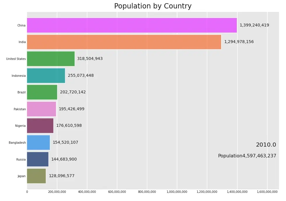
In our example we use a World Population from 1955 to 2020 dataset from kaggle or you can directly download dataset here . Installation of Bar Chart Race package pip3 install bar_chart_race pandas or using anaconda: Python Development
How Make Cutest Hand Drawn Charts in Python In this tutorial, I would like to introduce a very cool Python hand-painted style visualization package: cutecharts . Different from the common charts such as Matplotlib and seaborn, this package can be used to generate the following kinds of charts that look like hand drawn, and the effect may be better in some scenarios. Cute charts are also interactive and dynamic. Whenever the mouse is hovering on the chart, the numbers show up. Python Development